As we approach 2025, the world of web design continues to evolve at a rapid pace. Designers are pushing boundaries, blending cutting-edge technology with nostalgic elements to create immersive and engaging user experiences. From hyperrealistic 3D interfaces to the revival of vintage aesthetics, the upcoming trends promise to reshape the digital landscape. In this post, we’ll explore the top web design trends set to dominate in 2025, providing insights and examples to help you stay ahead of the curve.
Hyperreality: Bridging the Gap Between Digital and Physical
What is Hyperreality?
Hyperreality in web design refers to creating digital experiences that are so immersive and interactive they blur the line between the virtual and the real world. It leverages advanced technologies like augmented reality (AR), virtual reality (VR), and interactive 3D elements to engage users on a deeper level.
How to Implement Hyperreality:
Interactive 3D Elements: Incorporate 3D models that users can manipulate. For example, an online furniture store could allow users to rotate and view items from all angles or virtually place them in their homes using AR.
Surreal Animations: Use animations that defy the laws of physics to create an otherworldly experience. This could include floating objects, morphing shapes, or environments that change as the user navigates through the site.
Unexpected Design Features: Surprise users with playful elements like hidden easter eggs, interactive cursor effects, or backgrounds that react to user inputs.
Example: A fashion brand might create a virtual runway where users can control models, change outfits in real-time, and experience the show as if they were attending in person.
2. Adding a Human Touch: Authenticity in the Digital Age
What is the Human Touch Element?
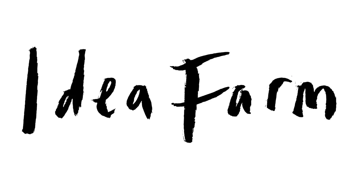
In an era dominated by technology, incorporating human elements into web design brings warmth and authenticity. It involves using hand-drawn illustrations, handwritten fonts, and other artistic touches that reflect human creativity.
How to Implement the Human Touch:
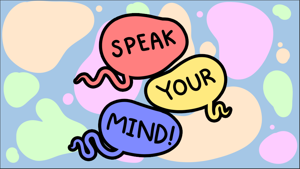
Hand-Drawn Illustrations: Use custom sketches or doodles to add personality. This works well for brands aiming for a friendly and approachable image.
Handwritten Fonts: Incorporate fonts that mimic handwriting to convey a personal message, ideal for testimonials or personal stories.
Organic Textures and Imperfections: Embrace imperfect lines, brush strokes, and textures to give a handcrafted feel.
Example: A bakery’s website could feature hand-drawn images of pastries and handwritten recipe notes to create a cosy, home-like atmosphere.

3. Brutalism: Embracing Minimalism with Bold Statements
What is Brutalist Web Design?
Brutalism in web design is characterised by its raw and straightforward approach. It strips away unnecessary elements, focusing on functionality with minimal styling, often featuring bold typography and stark layouts.
How to Implement Brutalism:
Simplify Layouts: Use grid-based designs with minimal colour schemes, focusing on black, white, and grey tones.
Bold Typography: Employ large, impactful fonts to draw attention to key messages.
High-Impact Photography: Integrate striking images that stand out against the minimalistic background.
Example: An art gallery’s website might use a brutalist design to let the artwork speak for itself, using simple layouts and bold text to provide context without distraction.

4. Interactive Whimsy: Playfulness Meets Functionality
What is Interactive Whimsy?
Interactive whimsy involves adding playful elements and animations to web design, creating a fun and engaging user experience without compromising functionality.
How to Implement Interactive Whimsy:
Subtle Animations: Use micro-interactions like hover effects, animated icons, or scrolling animations to delight users.
Neutral Base with Pops of Colour: Start with a neutral colour scheme and add vibrant accents to highlight interactive elements.
Interactive Typography: Make text elements interactive, such as clickable headlines that reveal more content or animated text that responds to user actions.
Example: A children’s educational site might include animated characters that guide users through the content, with interactive games embedded within the learning material.
5. Eco-Friendly Web Design: Sustainability Goes Digital
What is Eco-Friendly Web Design?
Eco-friendly web design focuses on reducing the environmental impact of websites by minimising energy consumption and promoting sustainability through design choices.
How to Implement Eco-Friendly Design:
Dark Mode: Offer dark mode options to reduce screen brightness and energy usage, which is particularly beneficial for devices with OLED screens.
System Fonts: Use default system fonts to reduce the need for additional font downloads, improving load times and reducing server requests.
Optimise Performance: Compress images, use efficient coding practices, and minimise the use of heavy scripts to reduce the website’s carbon footprint.
Example: An environmental organisation’s website could highlight its commitment to sustainability by adopting eco-friendly design practices and educating users about its benefits.
6. Maximalism: Bold, Loud, and Unapologetic
What is Maximalism in Web Design?
Maximalism embraces extravagance, featuring bold colours, elaborate patterns, and an abundance of elements. It’s about making a strong visual impact and creating an unforgettable user experience.
How to Implement Maximalism:
Bold Typography: Use large, decorative fonts that capture attention.
Vibrant Colours: Incorporate a rich colour palette with contrasting hues to create visual excitement.
Layered Elements: Combine images, patterns, and text to create depth and complexity.
Example: A music festival website might use maximalist design to convey the energy and vibrancy of the event, featuring colourful graphics and dynamic layouts.

7. Heritage Revitalisation: Nostalgia Meets Modern Design
What is Heritage Revitalisation?
Heritage revitalisation brings back design elements from the past, infusing them with modern aesthetics. It taps into nostalgia, using vintage fonts, colours, and patterns to create a sense of familiarity.
How to Implement Heritage Revitalisation:
Vintage Fonts: Use typefaces reminiscent of specific historical periods, such as art deco or Victorian styles.
Neutral Colours: Employ muted, earthy tones that evoke a classic feel.
Retro Patterns and Illustrations: Incorporate traditional patterns, such as damask or floral designs, and hand-drawn illustrations.
Example: A boutique clothing brand specialising in retro fashion might use heritage revitalisation to reflect the vintage nature of their products.

8. The 80s Trend: A Blast from the Past
What is the 80s Trend in Web Design?
The 80s trend celebrates the distinctive aesthetics of the 1980s, featuring bold colours, geometric shapes, and retro typography.
How to Implement the 80s Trend:
Grainy Background Textures: Use textures that mimic old VHS tapes or grainy photographs.
Pastel Gradients: Apply soft, single-colour gradients to backgrounds and elements.
Magazine-Style Layouts: Design pages resembling 80s magazines, with collage elements and overlapping images.
Retro Fonts: Choose typefaces that were popular in the 80s, such as pixelated or neon-style fonts.
Example: A tech company launching a retro-themed product could utilise the 80s trend to evoke nostalgia and connect with audiences who grew up during that era.

9. Dial-Up Design: Reviving the Early Internet
What is Dial-Up Design?
Dial-up design brings back the aesthetics of the early internet from the 90s and early 2000s, characterised by pixelated graphics, bright colours, and simple layouts.
How to Implement Dial-Up Design:
Pixelated Fonts and Graphics: Use low-resolution fonts and images to mimic the look of early computer displays.
Bright, Brash Colours: Incorporate bold and sometimes clashing colours reminiscent of old web pages.
Retro UI Elements: Include features like scroll bars, buttons, and icons styled after early operating systems.
Example: A digital agency might use dial-up design for a nostalgic marketing campaign, highlighting the evolution of web design over the decades.

10. Retro Future Feminine: Blending Y2K with Modern Feminism
What is Retro Future Feminine?
This trend combines the futuristic optimism of the early 2000s (Y2K) with modern feminine aesthetics, featuring soft colours, glitter, and sleek designs.
How to Implement Retro Future Feminine:
Y2K Fonts: Use typefaces that were popular around the turn of the millennium, such as rounded or techno-inspired fonts.
Soft Colour Palette: Employ pastel colours like lilac, baby blue, and pink to create a gentle visual appeal.
Bling and Glitter: Add sparkle effects to buttons and interactive elements to enhance the glamorous feel.
Example: A beauty brand targeting a young female audience might adopt this style to create an appealing and trendy online presence.
11. 3D Web Design: Adding Depth and Realism
What is 3D Web Design?
3D web design incorporates three-dimensional elements into websites, creating depth and a more immersive experience.
How to Implement 3D Design:
3D Graphics and Illustrations: Use 3D-rendered images and icons to enhance visuals.
Parallax Scrolling: Create an illusion of depth by having background images move slower than foreground images as the user scrolls.
Interactive 3D Environments: Develop interactive experiences where users can navigate through 3D spaces.
Example: An automotive company could use 3D models of their cars, allowing users to explore features interactively.

12. Dark Mode Web Design: Easy on the Eyes and Battery
What is Dark Mode?
Dark mode uses light-coloured text and elements on a dark background, reducing screen brightness and eye strain, especially in low-light environments.
How to Implement Dark Mode:
Dark Colour Schemes: Use shades of black, grey, or dark colours for backgrounds.
High Contrast Text: Ensure that text and important elements stand out against the dark background.
Toggle Option: Allow users to switch between light and dark modes according to their preference.
Example: Many social media platforms now offer dark mode to enhance user comfort and reduce energy consumption on devices.

13. Voice User Interface (VUI): Navigating Beyond Clicks
What is Voice User Interface?
VUI allows users to interact with websites through voice commands, enhancing accessibility and providing a hands-free experience.
How to Implement VUI:
Voice Commands: Integrate voice recognition technology to perform searches or navigate the site.
Text-to-Speech: Offer audio feedback or narration for content.
Accessibility Features: Improve usability for users with visual impairments or those who prefer auditory interaction.
Example: An online cookbook could enable users to navigate recipes using voice commands while cooking.
14. Neumorphism: The Modern Skeuomorphism
What is Neumorphism?
Neumorphism combines flat design with skeuomorphic elements, creating interfaces that appear soft and slightly extruded from the background, giving a tactile feel.
How to Implement Neumorphism:
Soft Shadows and Highlights: Use subtle shadows to make elements look embedded or raised.
Monochromatic Colour Schemes: Stick to a limited palette, often using variations of a single colour.
Minimalistic Icons: Design simple icons that blend seamlessly with the overall aesthetic.
Example: A finance app might use neumorphic design for buttons and input fields to create a modern, sleek interface.

15. AI-Driven Personalisation: Tailoring Experiences to Users
What is AI-Driven Personalisation?
Artificial intelligence analyses user behaviour to provide personalised content, recommendations, and experiences.
How to Implement AI Personalisation:
Dynamic Content: Display content based on user preferences and browsing history.
Chatbots: Use AI-powered chatbots to provide instant customer support and guidance.
Predictive Recommendations: Suggest products or content that users are likely to be interested in.
Example: An e-commerce site could use AI to recommend products based on previous purchases and browsing habits.

16. Glassmorphism: Transparent and Translucent Aesthetics
What is Glassmorphism?
Glassmorphism features translucent elements with blurred backgrounds, resembling frosted glass, adding depth and layering to the design.
How to Implement Glassmorphism:
Blur Effects: Apply background blur to translucent elements to create the glass effect.
Multiple Layers: Stack elements to enhance the sense of depth.
Vivid Backgrounds: Use colourful or gradient backgrounds to make the glass elements stand out.
Example: A portfolio website could use glassmorphic cards to showcase projects, giving a modern and sophisticated look.

The web design trends of 2025 reflect a fascinating blend of innovation and nostalgia. Designers are not only leveraging advanced technologies like AI and 3D graphics but also revisiting and revitalising styles from past decades. Whether it’s creating immersive hyperreal experiences or adding a human touch with handcrafted elements, the key is to provide engaging, user-centric designs that stand out in a crowded digital space. By embracing these trends thoughtfully, you can create websites that are not only visually stunning but also offer meaningful and memorable user experiences.
